Every kid dreams of flying planes at some point in their life. That may or may not be possible for some of you out there. Hence, the app Flight Control.
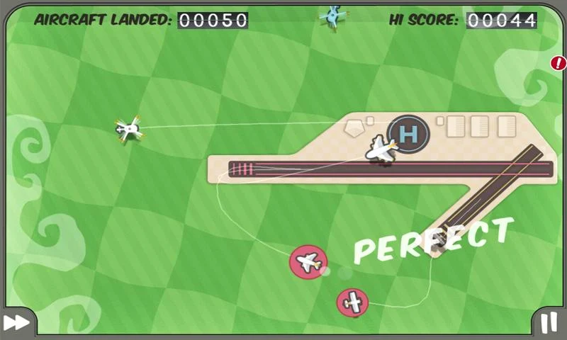
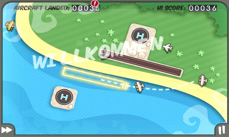
Flight Control is a flight simulator where you basically navigate different types of aerial vehicles to their respective landing zones, which can be either 2 types of runway or a helipad.
It features several different locations but the most popular ones are the aircraft carrier and the beach.
The level of difficulty increases with the number of successful landings.
Different air vehicles include jets, biplanes, helicopters, jumbo jet etc.
Overall, this is a very fun, simple game which provides an excellent means for relaxation and unwinding.
And don't worry if your plane collides or crashes, you have the ability to replay the game prior to the collision provided you have enough Rewinds.
The app is available for both Android and iOS.
You can download the app for Android by clicking here.
You can download the app for iOS by clicking here.
So that's our review on the app Flight Control, hope you have fun piloting planes.
Be sure to +1 this post on Google Plus as it most definitely helps us.
Blackberry has been in hot waters recently. The once leader in the smartphone industry, has had a spiraling journey downward, ever since the release of the iPhone. Since then, BlackBerry has made several attempts to enter back into the game which has been evident with the launch of the BlackBerry Z10, Q10 and the phablet Z30 (review coming soon).
However, BlackBerry has realized that (a little late) that the software in a device is given much more value than the internals which run the device. As a result BlackBerry has recently released one of its priced apps, the BlackBerry Messenger in both iTunes Store and Google's Play Store. And the app has also reportedly been downloaded 10 million times in both stores in 24 hours.
The app is pretty neatly designed. The blue, black and blue color scheme reminds us of BlackBerry's OS 10.
It carries more than just colors from BlackBerry OS since it includes much of its swipe based functions.
For example, if you to the right you can access your contacts, chats, updates etc.
You can swipe from within the chat to return to your previous screen.
Adding people using unique QR codes is not only intuitive way to add people on BBM but is also hassle-free.
As always the Emoji collection on BBM has always been vast and remains unchanged even in iOS and Android.
Some users have complained about waiting for long duration's for their BBM pin.
All in all we think that this is an excellent path chosen by BlackBerry to get back in the game and it also seems that it is working for them.
You can download BBM for your iOS device by clicking here.
You can download BBM for your Android device by clicking here.
So that's our review on the BlackBerry Messenger.
Be sure to +1 this page on Google Plus as it definitely helps us a lot.
Yes, it has been a long time since iOS 7 has released but we decided to give you a more in-depth review by thoroughly reviewing the Mobile Operating System.
Even though iOS 7 does look better, it can be clearly observed that it still carries the traits of the first version iOS with a few tweaks here and there and a few animations.
New Tweaks:
Firstly the lock-screen has been given a new avatar, with no trace of the sliding bar that we were so used to.
Instead there is a plain and simple screen with a live wallpaper in the background which looks strikingly similar to the live wallpapers found in the Nexus devices.
We still have to slide the screen to unlock the device but we are given a much more clean interface with an opaque floating display for the time. Another surprising feature of the lock-screen which looks to be "borrowed" from Android is the fact that you can swipe to the right to get something like the lock-screen widgets which was first introduced in Android 4.2.
On unlocking the device the icons appear on the screen with an animation that was previously not observed.
The animation give the viewer an effect that the icons are arriving from beyond the screen.
Icons:
Speaking of the icons, this is area where iOS has undergone most of its "Glossy-Makeup". The icons appear more colorful and animated adding a palette of color to the otherwise dull homescreens of iOS.
The homescreens are also sensitive to movement and you can experience this by moving the device which will also cause the icons to move in the same fashion, giving the icons, and indirectly the homescreen a 3D dimension.
Control Center:
Apart from this a striking feature of the homescreens is a small tab on the bottom of the screen which if you swipe up gives you access to one of the newly introduced features of iOS 7 which is Control Center.
It is very similar to the notification shade found in almost every version of Android right from the sta
rt.
It gives you access to various functions and also the toggles for the various settings such as Wi-Fi, Bluetooth, Flashlight etc.
App Interface:
The stock apps are also give a certain revamp. The main apps which have undergone this change is mainly the calender app, the weather app and the calculator to name a few.
The weather app really awed us and clearly distinguished itself from the other apps. The animations and the sheer thought that has gone into making the new version of the app has can be clearly seen. The moment you press weather icon, depending on the weather of the region you are, the animation will be shown accordingly.
In the press event, they gave the example of a region and the animations awed us and it looked like the sequences were taken straight from a J.K Rowling book. It also makes us recall the animations which were seen in the initial versions of Sense which is HTC's skin atop Android.
The calender and the calculator app have clean, simple and white interface's which makes it that much more easier to use.
Notification Shade And The Little Things:
The notification shade is also made cleaner from the chunky and untidy notification shade which made its entry in iOS 6.0.
Apple has also paid attention to the little things such as the signal "bar" which is replaced with 5 circles which indicate, well the signal strength.
Another striking point to be noted is the fact that the Spotlight feature that used to feature to the left of the main homescreens can no longer be seen.
All in all we believe that iOS 7 has brought some new features to the table and might continue to impress the general population but it still carries the same interface that was seen right from its first version. The floating icons fixed in the grid of the homescreens and the Slide To Unlock Lockscreen. It still gives us a reminiscent of the idea of iOS and its simple intuitive interface.
So that's our review on iOS 7, which also happ
ens to be our first operating system review. Stay tuned for the review on the Mavericks OS.
Be sure to +1 this post of Google Plus as it definitely helps us a lot.
iPad's have been here for a long time and ever since their release they have been leading the baton in tablet innovation and technology. But the recent models of the iPad where good, but they lacked the luster that the first iPad had, cause lets admit it was PRETTY spectacular. But is the 2013 iPad's here to change all that ?
Lets See.
Display:
Every iPad has had a jaw-dropping, crystal clear display right from the beginning, and this iPad in all its Retina-Display glory is no exception. With a 9.7 inch, 1536x2048 resolution screen with a pixel density maxed out at 264 ppi it is one of the better looking screens's in the market.
It doesn't feature Corning's Gorilla Glass which is a shame, considering that you have to be extra careful because it looks like a pretty delicate gadget.
Internal Specs:
The iPad air features Apple's traditional A7 Chipset featuring a Dual-Core 1.3 GHz Cyclone.
The Graphics on the iPad is powered by PowerVR G6430 which is quad-core GPU for those who are interested. It features an average 1 GB RAM.
But from time to time products like the Lumia and the i devices prove that you don't need paper shredding specs for amazingly smooth and fast interface.
Battery:
What does it take to run a mammoth of a device like this ? Surprisingly not much. Just a 32.4 Wh Non-Removable Li-ion battery.
Operating System:
The iPad Air features the newest version of iOS that is iOS 7.0.2 right out of the box. For a detailed review on iOS 7, please wait for a detailed review.
Memory and Variants:
There are 4 different variants available on the basis of memory which includes 16, 32, 64 and 128 GB.
Among these you also have the option to choose between Wi-Fi as well as 4G LTE. They are also priced accordingly.
Colors and Price:
It is available in two colors that is, Space Gray and silver.
It is retailing for about $499 which is starting price and runs all the way upto $929. Yes it will definitely burn some holes in your pockets, but iPad's are always known for their ridiculous price tags. If you are searching for a cheaper tablets you can check out the Nexus 7 here.
Conclusion:
Almost all Apple products are concentrated at a particular audience the
y do really well in those audience. However Apple is making several attempts to try to appease the lower budget crowds with the introduction of the iPhone 5c and the iPad Mini with Retina-Display. Keep tuned to this space for reviews on the iPhone 5c and the iPad Mini.
So that's our review on the Apple iPad Air
Be sure to +1 this post on Google Plus cause it will help us a lot.